Kerikeri: What's the verdict after 12 months?
- By Cliff Mail
- Dec 14, 2019
- 2 min read
The most revealing statistic from our first 12 months of promotion of the idea of a carbon neutral Kerikeri is the number of households who have not shown any interest in calculating their carbon emissions. If we assume that there are around 5,000 households in the greater Kerikeri area (our Kerikeri team have been targeting these - see attached report) then it would appear that we have a participation rate of around 1.8%. So...
98.2% of household do not know what their carbon emissions are!
We suspect that this is probably reflective of the situation across New Zealand and the World. Not an encouraging statistic! The argument that; what we do as individuals is not going to make any difference, simply does not stack up.
What is the ocean but a collection of drops!
On a more positive note, those Kerikeri households that have participated have at least given us some insight into their carbon emissions and sequestration. Looking at average emissions v average sequestration; the 89 households collectively were net sequesters. Breaking that down by household, the data painted a different, but still positive, picture with 56% of householders being net sequesters.
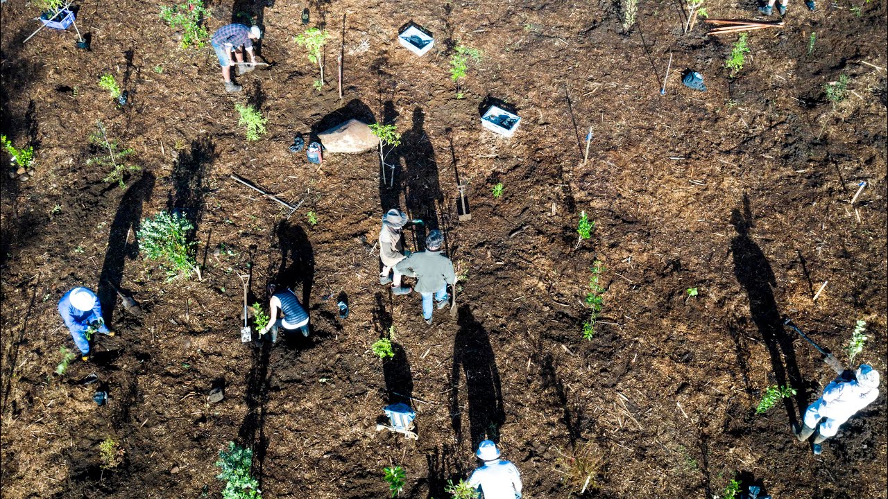
Kerikeri is probably not a good reflection of the average NZ urban (or rural) localities, especially larger urban centres. Kerikeri has a large rural and semi rural catchment with a high proportion of 'non-farm households' that are really oversize residential properties. These larger rural (and even urban) properties offer more opportunity to sequester carbon and this is reflected in the rural / urban breakdown (image below).

The calculator breaks out aggregate households emissions by category (image below). Using our planning tool and our list of suggestions for reducing emissions, it should be possible for each household to identify how they could best achieve an annual 10% reduction in emissions. The easiest targets are travel and transport. The former is often a discretionary activity while more planning around local Kerikeri transport could make an impact. The table below shows the aggregated emissions expressed as a share of the total.

You can download our brief analysis of the Kerikeri data at this link (PDF)


Comments